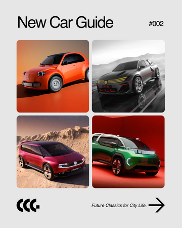
The Meaning Behind Our Logo.
As Car City Guide approaches its 5th anniversary in June 2026, we have developed a new logo mark for our future endeavors.
Compared to our previous design, the new logo features a more minimalist form.
By stripping away unnecessary elements and enhancing its simple, iconic quality, we aim to express CCG’s commitment to continued refinement.
We designed this mark to leave a strong impression not only on social media icons and our website but also when applied to stickers, apparel, and various other products.
Furthermore, the entire logo is constructed based on geometric shapes.
By combining arcs and straight lines, we achieved a design that balances a classical mood with a modern aesthetic.
This reflects CCG’s stance of presenting classic cars not merely through a lens of nostalgia, but as a way to enjoy modern lifestyles and city life.


Credit
Creative Direction: Makoto Nakamura / MULTESE inc.
Design: Motoi Furui
Motion Graphics: Kairi Sato
Sound: Ko Ando / Sponge Bang Bang